I redesigned fund investing for people who had never invested
Users of an Argentine fintech bought dollars and left the rest of their money idle. I designed the investment flow that reduced support questions.
Calculating...|
My role
Product Designer. Sole designer on the team
Team
1 Product Manager 2 developers
Duration
6 weeks
Scope
Launched on iOS and Android for all users
Stakeholders wanted to launch several products at once. I proposed an order.
The company needed more active users and to retain them. Most people used the app to buy and sell dollars, and left the rest in an interest-bearing account. There was no numeric goal: the request was to go to market with several new products.
With one PM and two developers, doing everything at once meant doing everything halfway. In a meeting with the stakeholders, I proposed launching in sequence: loans first, then mutual funds. They agreed. This case covers the second launch.
Support messages revealed the real problem
The support team was getting messages from users who got stuck trying to invest in a fund. Reading them, I found a pattern: nobody asked which fund was best. They asked whether they could lose their money, when they could withdraw it and how much they would earn.
The team’s initial idea was to show every available fund. For someone who had never invested, more options meant more reasons to hesitate. I decided to design for that beginner, not for the experienced investor.
Beginners didn’t lack options: they lacked confidence that they would get their money back.
Every fund or just a few: I settled it with two prototypes
The stakeholders preferred a technical, marketplace-style approach: many funds with their full fact sheets. I proposed the opposite: a few funds grouped by term (short, medium and long), jargon-free language and explanations at the moment the question comes up.
Instead of debating opinions, I built a prototype of each option. Eight people from the team did the same task with both: invest in a fund. I observed how long it took them, what they asked along the way, what doubts they still had at the end and where they got stuck. The guided version performed better on every point. It was an internal test, but it was enough for the stakeholders to change their position.
What I gave up: experienced users would find less technical information. They weren’t the audience for this stage.
What I left out: the training tutorials. They didn’t fit in six weeks, and the in-context help covered the essentials.
A constraint that helped: the providers allowed fewer funds than planned, which reinforced the decision.
Two moments that address the fear of losing money
1. Choosing a fund without knowing about funds
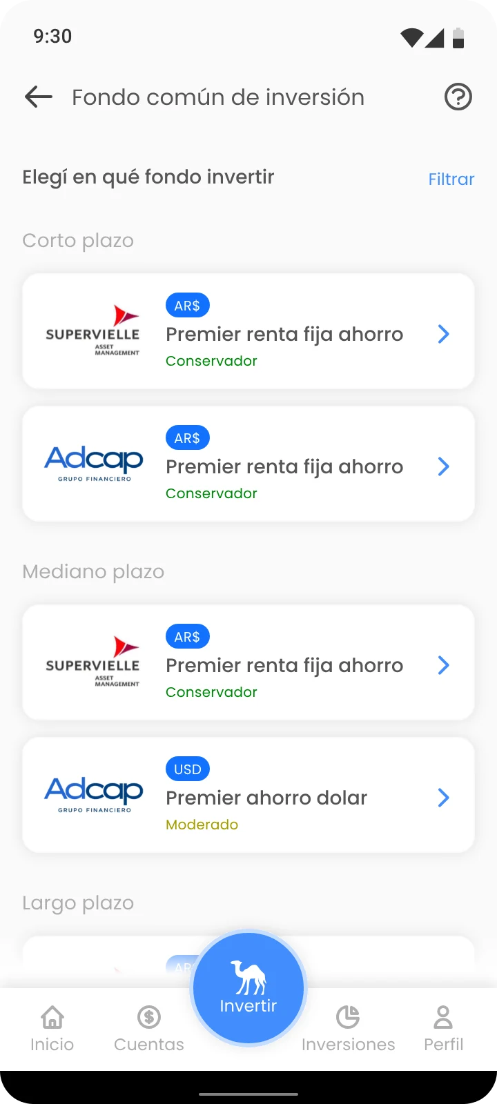
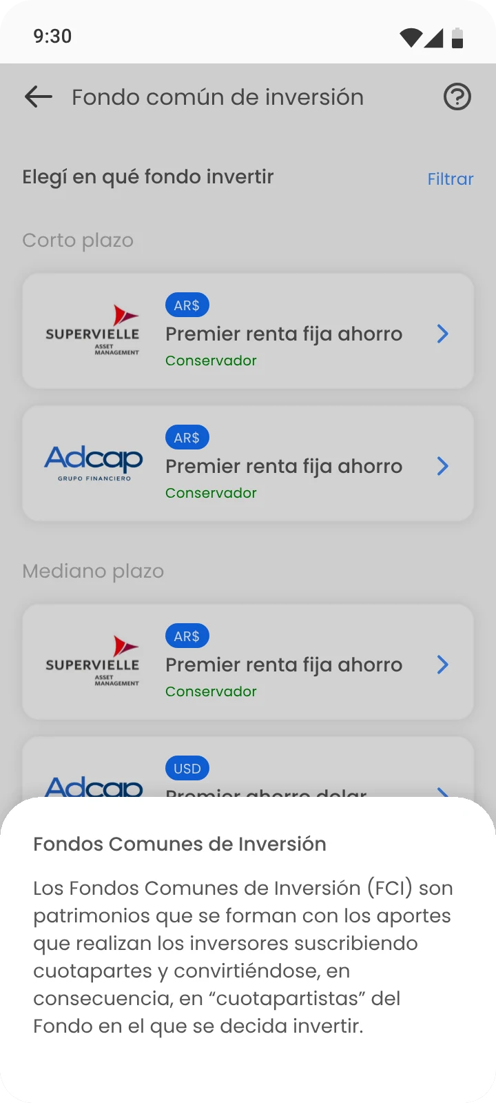
I grouped the funds by term and added a risk label (conservative, moderate) so users could see the difference without having to research. Next to difficult concepts I added an icon that opens the explanation in a bottom sheet, without leaving the flow. The provider defined the text of each explanation and it couldn’t be simplified. What I did decide was what to show, when and in what context.
Funds grouped by termIn-context help
2. Investing with the information in plain sight
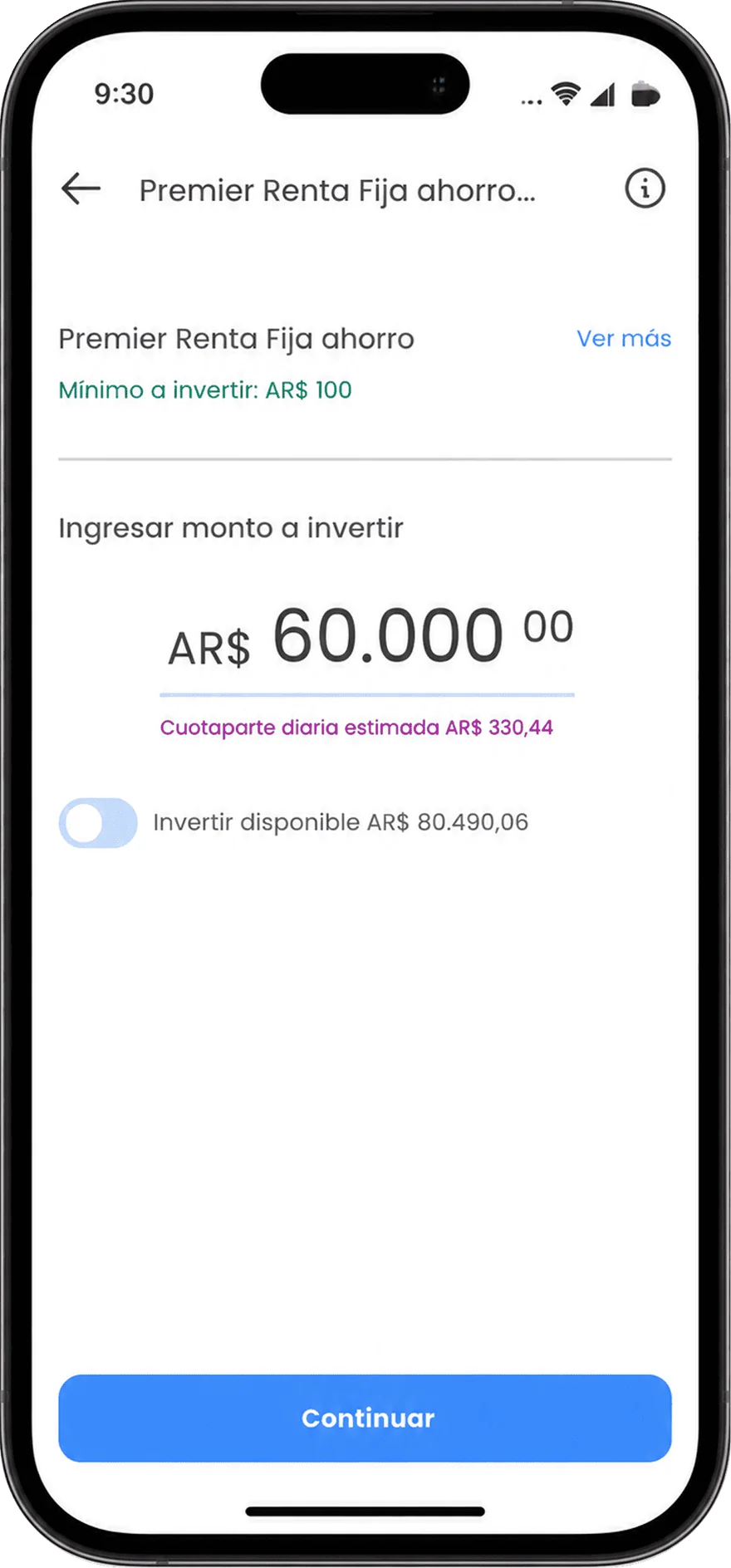
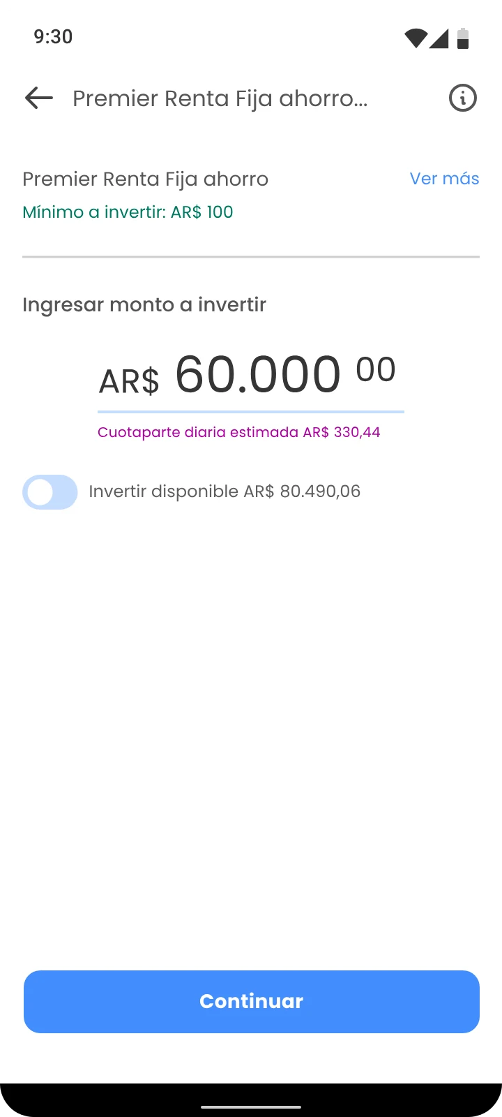
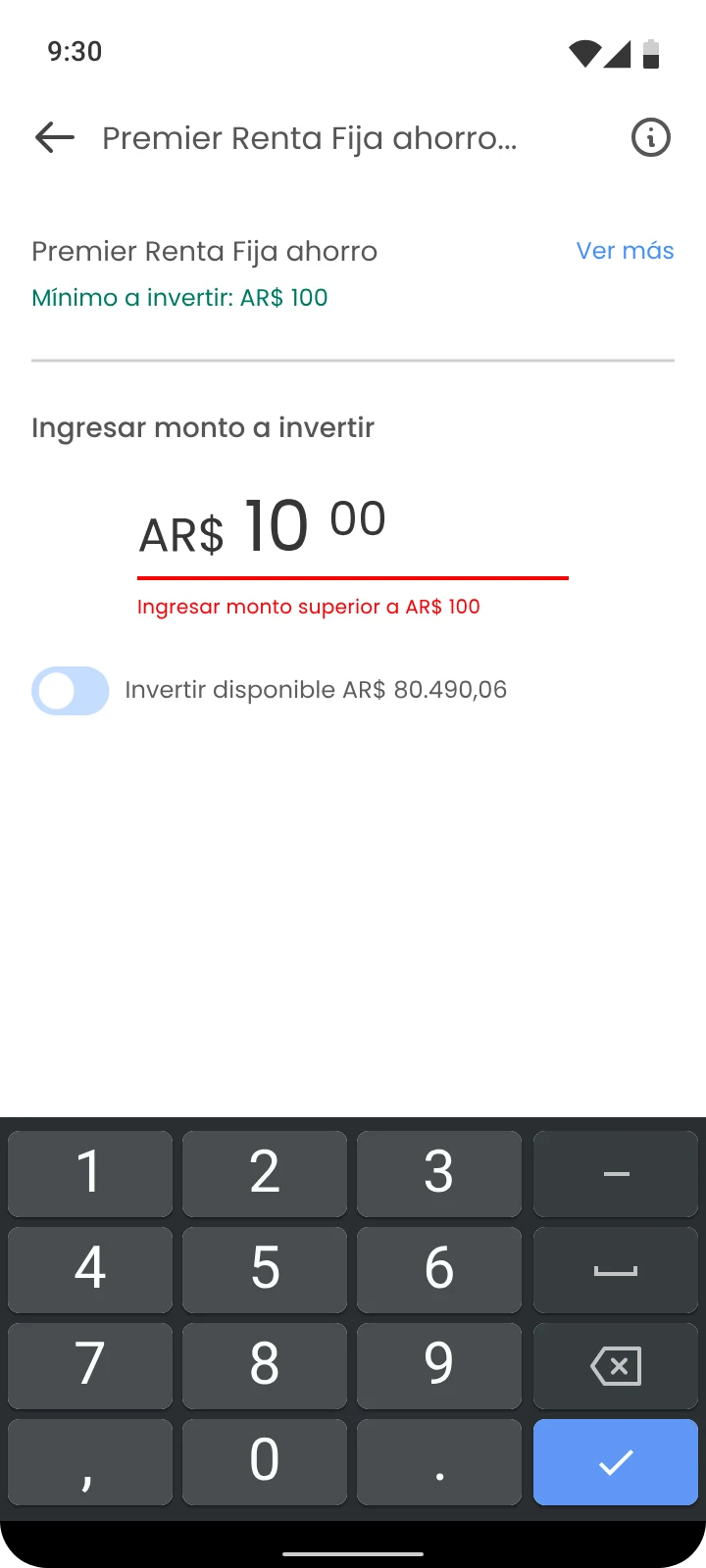
Amount entry uses the same pattern as the rest of the app, so nobody has to learn something new. While typing, users see the estimated daily unit value, that is, how much each share of the fund they’re buying is worth today. If the amount is below the minimum or above the balance, the error shows up right away, not at the end.
Amount and estimated unit valueImmediate error
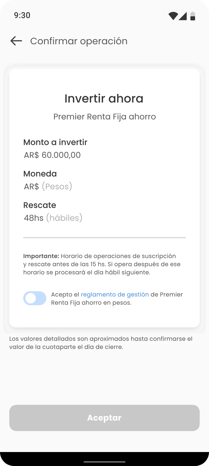
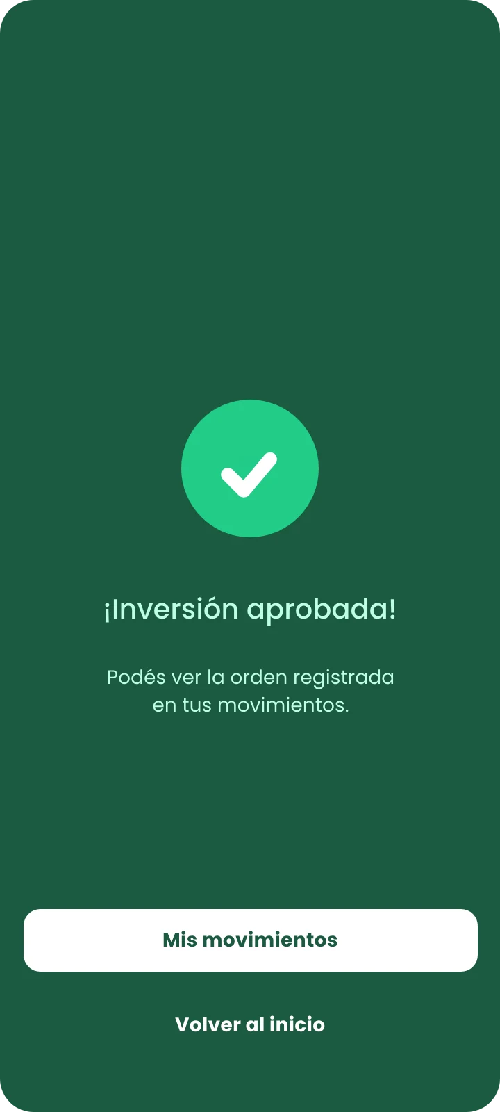
Before confirming, the screen summarizes the amount, the currency and, above all, the withdrawal time: how long it takes for the money to come back if the user withdraws it (48 business hours). That line answers the question support got most often: when can I take my money out. Then a success screen confirms the investment was recorded.
Summary before confirmingInvestment approved
What I fixed before launch and what I found afterwards
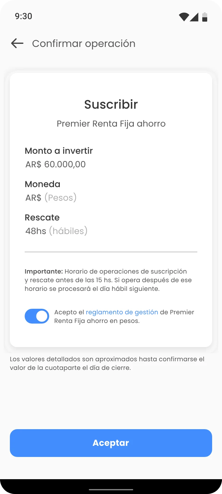
The internal tests led to concrete changes. I replaced "Subscribe" with "Invest now" in the confirmation title, to name what users actually wanted to do. I added the minimum amount error, balance validation and the option to invest the entire available balance.
BeforeAfter (launched version)
After launch I ran a usability test and a survey with five users. Nothing stopped them from investing, but three problems came up: the chart summarizing their investments was hard to understand, some text was hard to read because of its size, and they doubted the estimated unit value was daily, even though the screen said so. These were logged as improvements for the next version.
After launch, support questions went down
The flow launched for all iOS and Android users. Support questions about the three doubts that started the design went down: how to invest in a fund, when the money can be withdrawn and how much you earn. It was the sign that the flow now answered on screen what users used to have to ask.
What I would do differently
Define metrics before launch. We didn’t, and I moved to another company a few weeks later, so the impact stayed as indirect evidence. Today I would measure three business metrics: activation rate (users who make their first fund investment), amount invested in funds and retention of those new investors. To understand what drives them, I would add conversion and drop-off at each step of the flow.
Check contrast and text size from the start. Users pointed it out themselves in the test.